Kalindar App
Problem
Group plans are made in hell. I experienced this first hand when I moved to Bangalore, India. My friends were scattered all over the city. I had the toughest time making group plans. No one agrees to a venue or time. Not everyone is available at the same time. Just as a plan is getting finalized, someone changes their mind. Making a successful group plan took almost everything out of me. I soon began to realize this problem was ailing all friends groups. So in 2019, a couple of designer friends and me designed an app that would make group plans extremely easy to do.
Role & duration
I spearheaded this project as the user experience and visual designer. I collaborated with another designer: Dhaumya Mehta during user interviews and early brainstorming.
The project was done on 2 week design sprint. Week 1 was user research, analysis, wireframes. Week 2 was style guide, component library, visual design, prototyping and testing for feedback.
Process
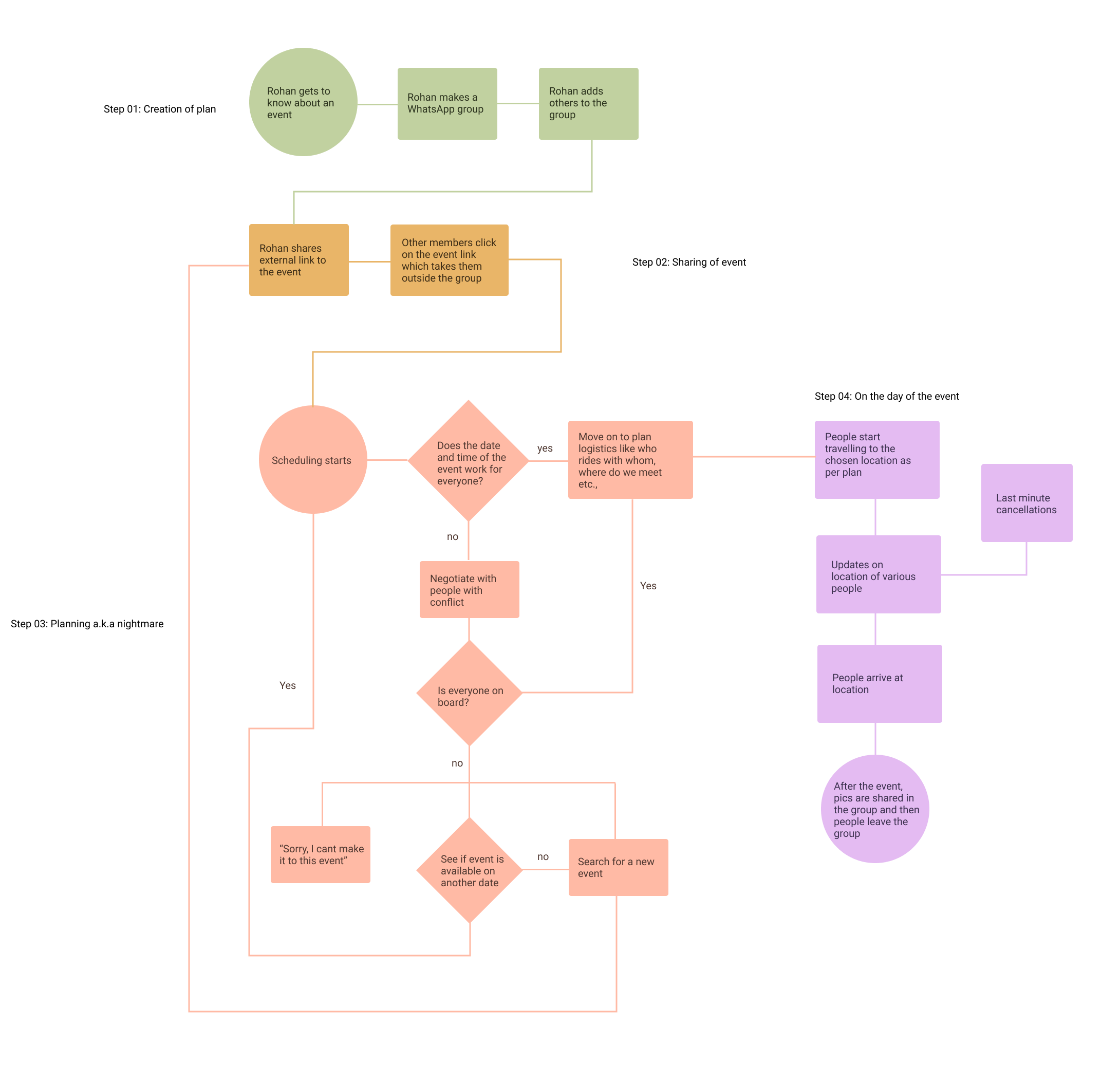
01. User research
First step was to understand how people go about making group plans. We narrowed down the demographic to urban India with an age group between 18-35. This was based on the statistic of people who attend major cultural events in the cities - music festivals, food festivals, pubs, movies etc., We then spoke to a group of 6 youngsters to understand how they went about a group plan. We also looked into our own WhatsApp group chats to manually track the errors creeping into plans.
The major questions we were asking were:
How do they plan an event? What are the pain points they face? What are the major reason plans fall through? What applications do they use to plan these events? What are typical sizes of these groups?
02. Insights & Analysis
We spent two days interviewing people and collated all the data. Very quickly we learnt a few things.
Firstly, there was a distinct anatomy for any group plan. We can see the major pain points for the group plan - communication with each during early phases, people’s hatred for WhatsApp groups and therefore lack of involvement, selecting events, tracking whereabouts and coordinating on the day of the event.
Second, there was a clear breaking point for group sizes. For groups of 3 or less, plans usually came through. People coordinated fairly easily with each other. From 4 to 6, the chaos of plans started to grow. For groups of 6 and above, plans had the most possibility of failing.
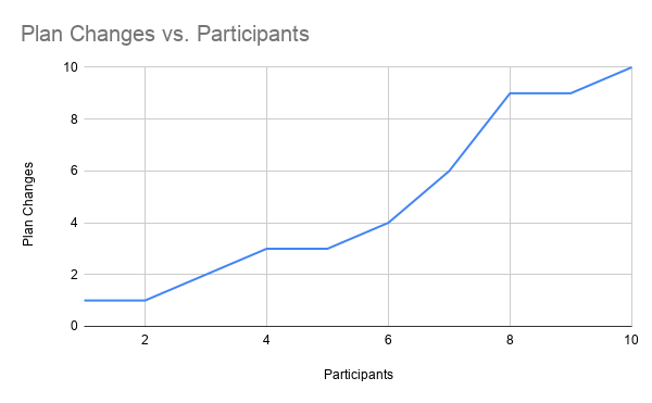
The data is based on the chat history of 6 people we interviewed plus our own - total 9 WhatsApp chats as of 2019
Third, the manner in which they coordinated with each other. This was usually through multiple apps like Google Calendar for dates, WhatsApp for groups and Facebook for events. Switching between multiple apps was bit cumbersome for most of them.
Key takeaways:
Calendar, chats and events have to be in the same app
The group chats should delete on its own once the event is done
Fix pain points of group plan workflow
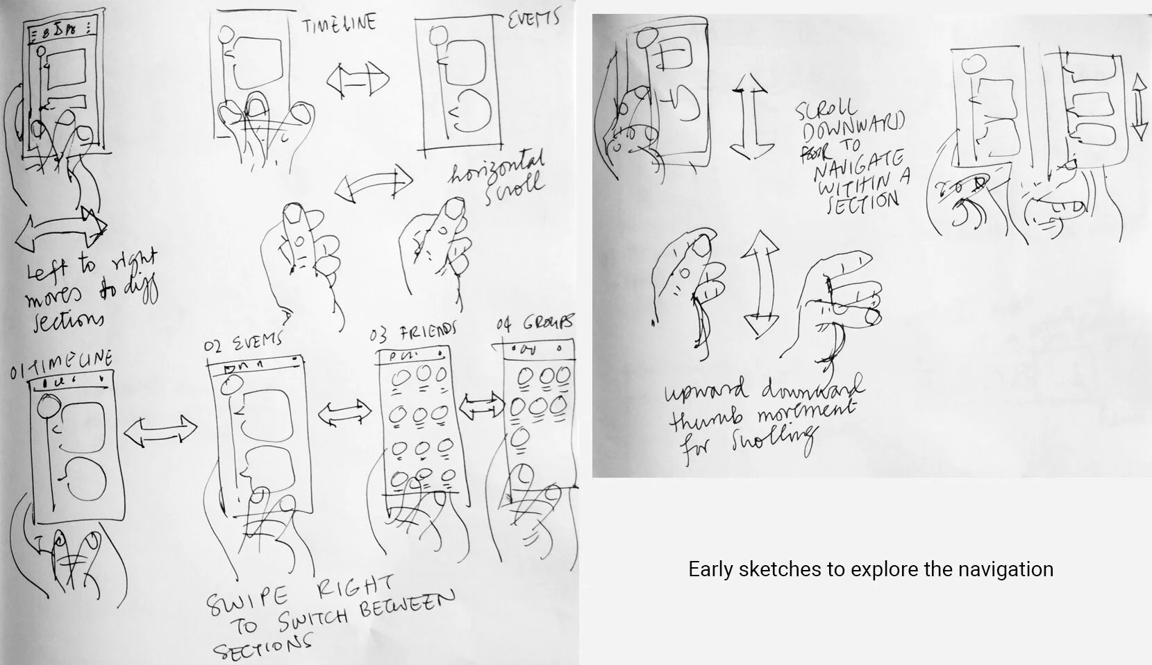
03. Interaction style - Swipe
We started to observe how young Indians interact with their phones. What we realised was a lot of them had a tendency to hold the phone in one hand while manipulating something with the other - hold a bag, work on their laptops, hold the bars in a bus/train etc., This meant only one hand was available for interaction.
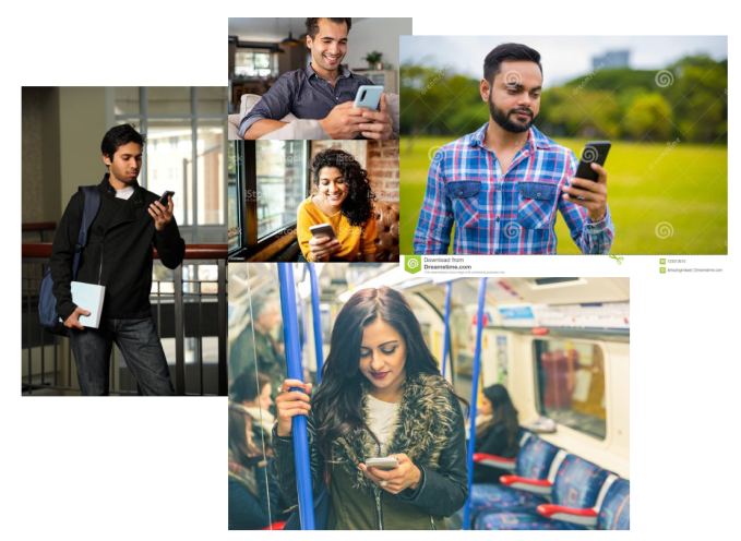
The image is representational to protect privacy of actual users we photographed. Copyright belongs to original owners of these images. Source: Google images
The logical conclusion was to use the thumb as primary interaction. Swipe, tap and scroll had to be done through one finger. Around 2016, Tinder was introduced in India. By 2019, everyone was very comfortable with the swipe action. So we built our interaction on that.
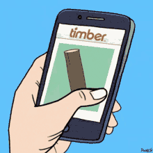
Image copyright Tenor Gifs
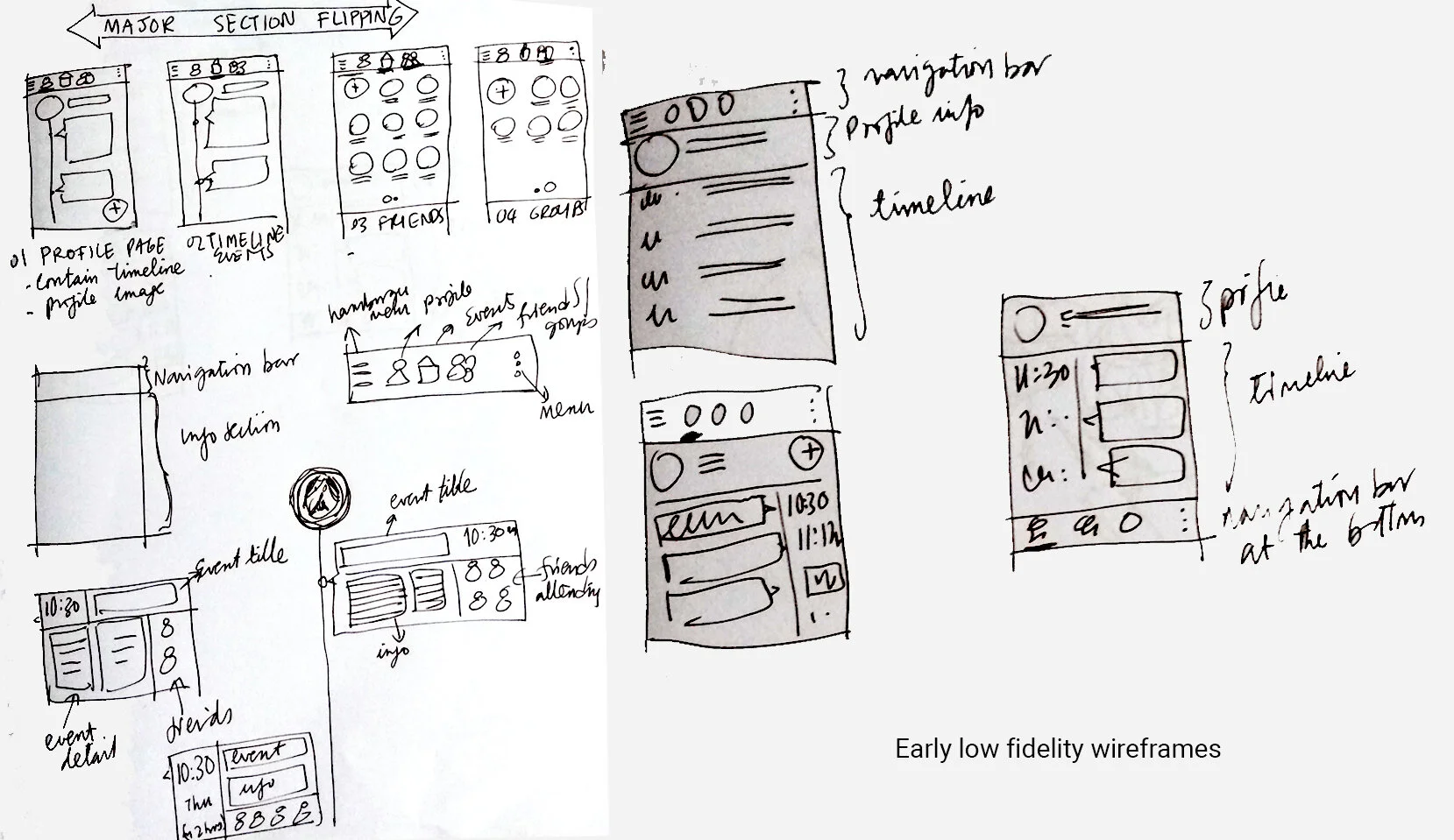
04. Wireframes & Workflow
Based on the thumb movement, I started doodling how different screens and interactions should be. Here are some sketches from that phase.
Here are some early low fidelity sketches for wireframes I made. Since this was not a very complicated application, I kept the wireframes very simple. It served primarily to plan where what went.
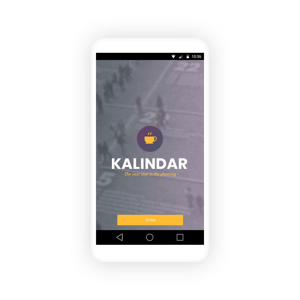
05. Color palette & visual style
I picked more traditional complementary color scheme - purple and yellow. Purple tends to be easy on the eyes and goes well with blues which are cool colors and magentas which are warm. This gave me a lot of room for choices. Yellow became the accent color - to be used sparingly primarily in interactions.
The proportion of purple to yellow would be 70-30 or lesser (80-20).
Choosing the color gave me the ability to build a style guide. Here is a small sample of the style guide with interaction details and a finished screen.
Final Solution
We spent two days interviewing people and collated all the data. Very quickly we learnt a few things.
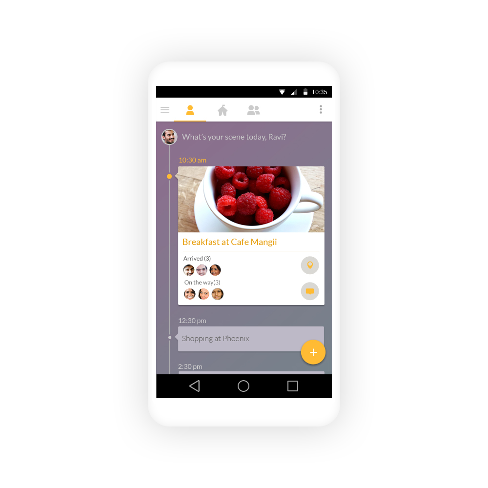
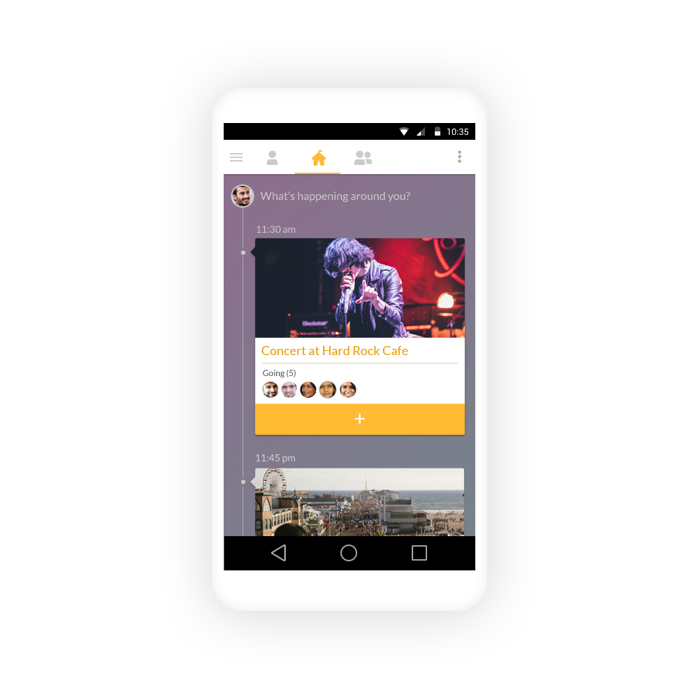
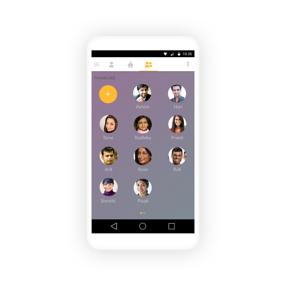
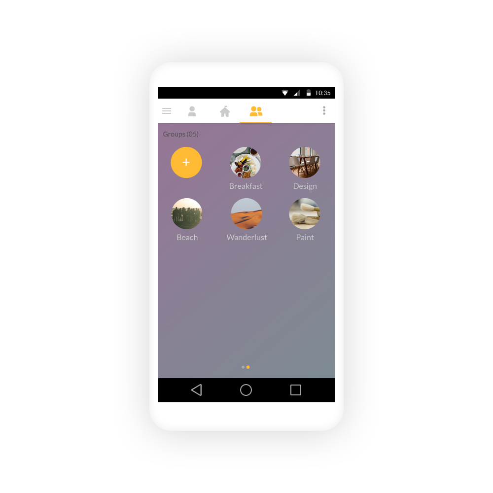
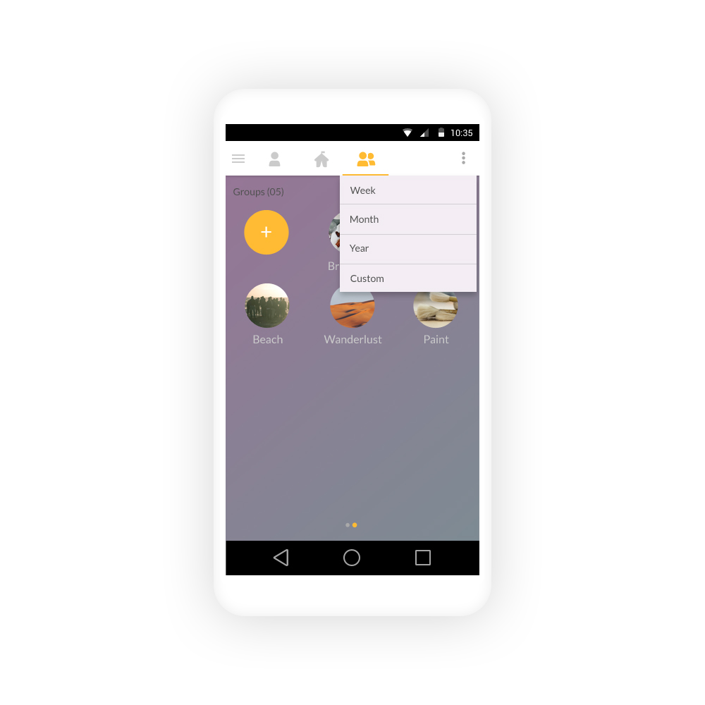
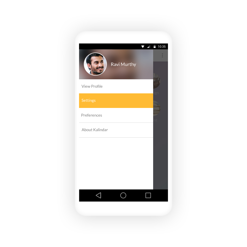
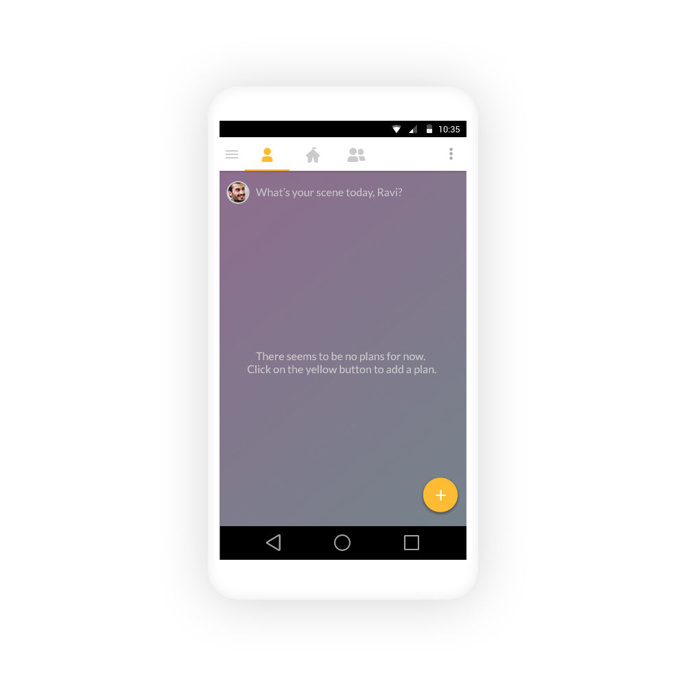
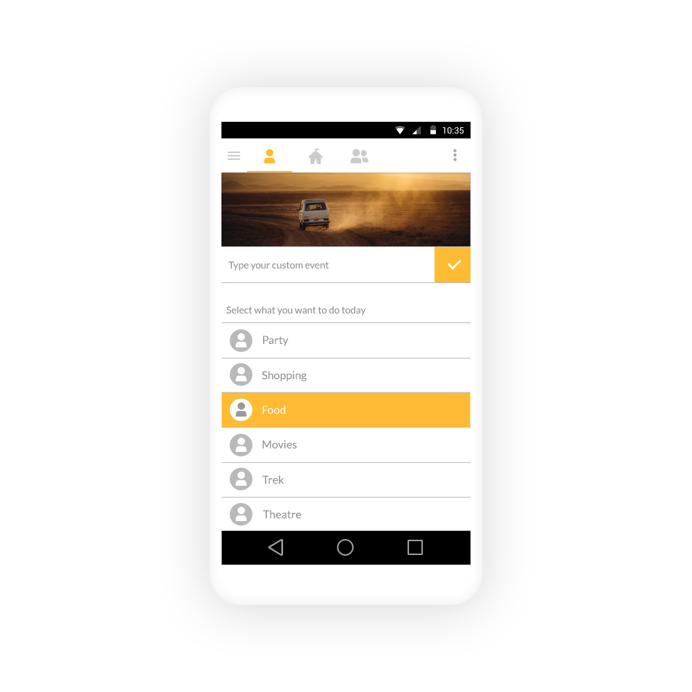
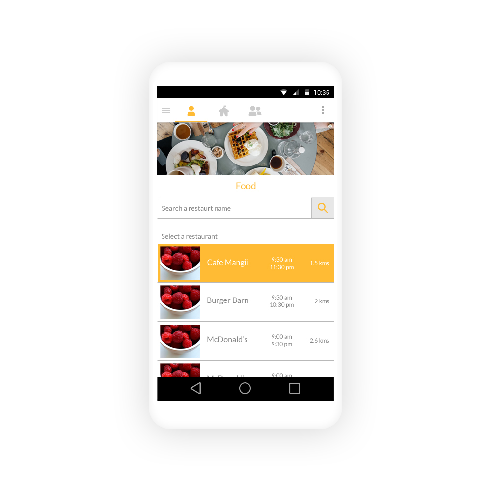
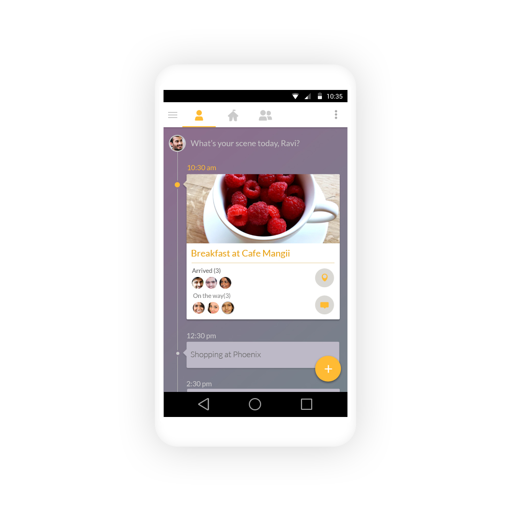
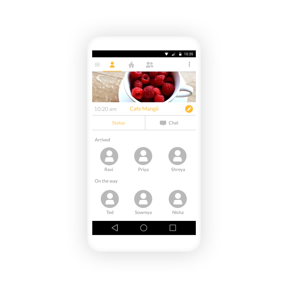
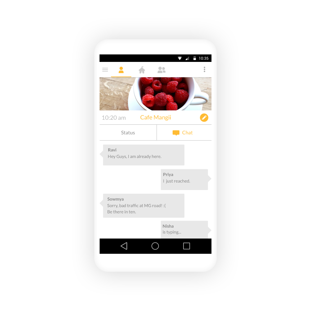
Here are all the screens for the workflow of selecting an event and following up with friends.
Results & Learnings
We tested the prototype of the app on our friends.
Good:
The swipe action was generally appreciated
Being able to see each other’s schedule received a positive response
The event page was well received
Color palette was well received
Bad:
The issue of yet another community for chat was pointed out. We hadn’t fixed the reason people dislike WhatsApp group chats - too many notifications.
Key learnings and areas of improvements:
Design process works. By following group plan workflow, we were able to spot areas that can be problematic and managed to fix it.
If its in the market, it will be an interesting question to explore: will people like to communicate on the app itself or will they use the app for planning and continue to chat on WhatsApp
We used a sample of 6 people due to time and resource constraints. If the sample had been bigger, say by online polling, results might have been different. Its worth exploring
This was an exercise for urban, English speaking, young affluent audience. This forms a very small percentage of the youth in India. How do we adapt this app for pan-India population? How will this app work for non English speakers? These are areas worth exploring.