User Testing
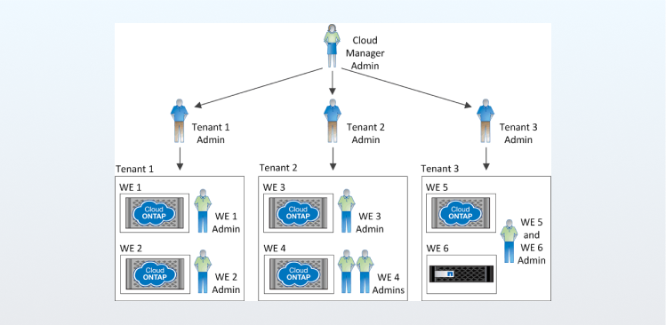
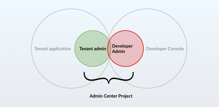
First step was to unpack the two applications' workflow, the structure of OT2 and figure out the overlaps in all of them.
Once we had a rough understanding of all the features present amongst these applications, we conducted multiple research sessions with Product managers, UX designers, Development heads and potential users.
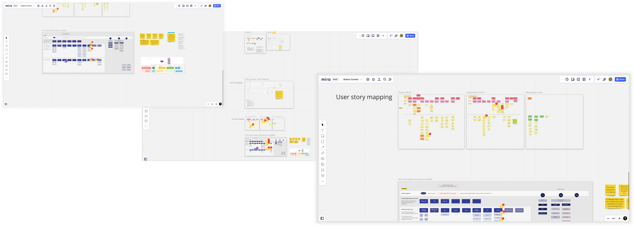
Based on these findings, we shortlisted a handful of features that would overlap and a workflow that worked best for the combined admin center
Sprint Planning
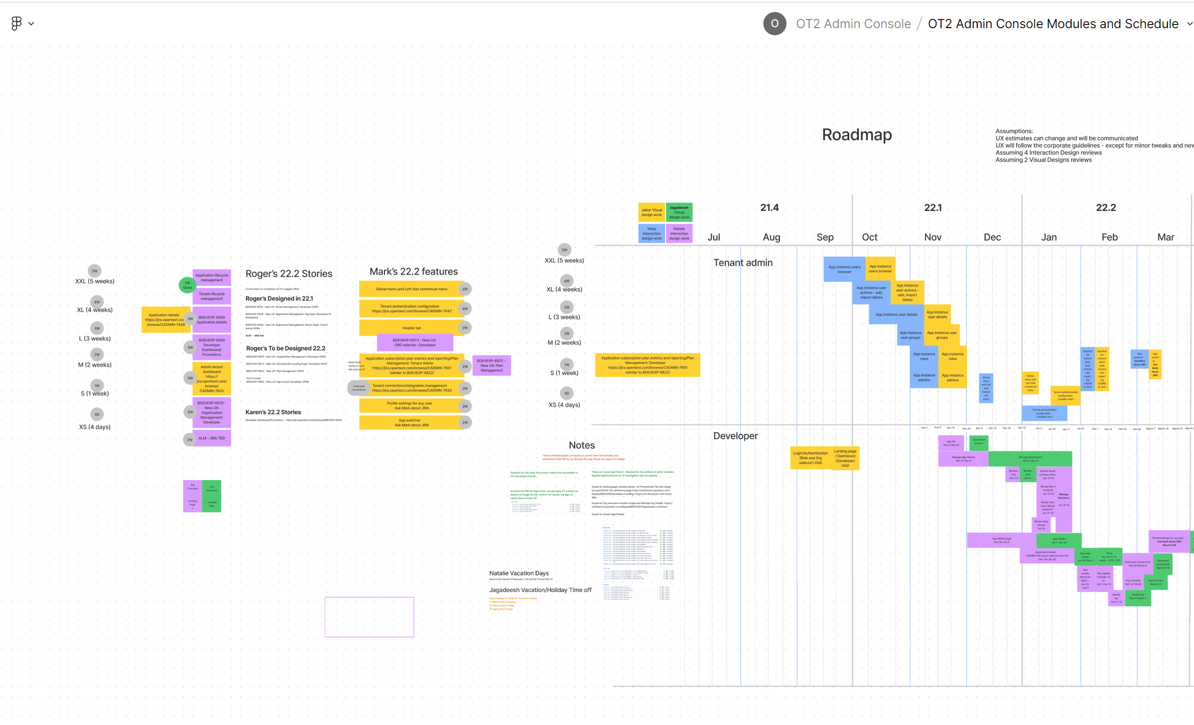
Once we had a list of features, we planned our deliverables in sprints.
First get consensus on what features are the most important. Then do a t-shirt size method of quantifying times for each feature.
We then laid it out in two week sprints across a timeline to get a rough estimate of how long the project would take. This really helped us deliver the work on time with good quality.
UX
Desktop only app - decision was made
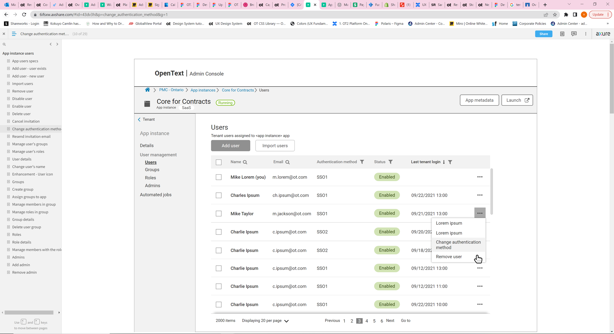
Once we had the list of features to attack and a sprint plan in place, our UX designer did a great job of designing, iterating, user testing and finally getting a finished wireframe.
Visual Design
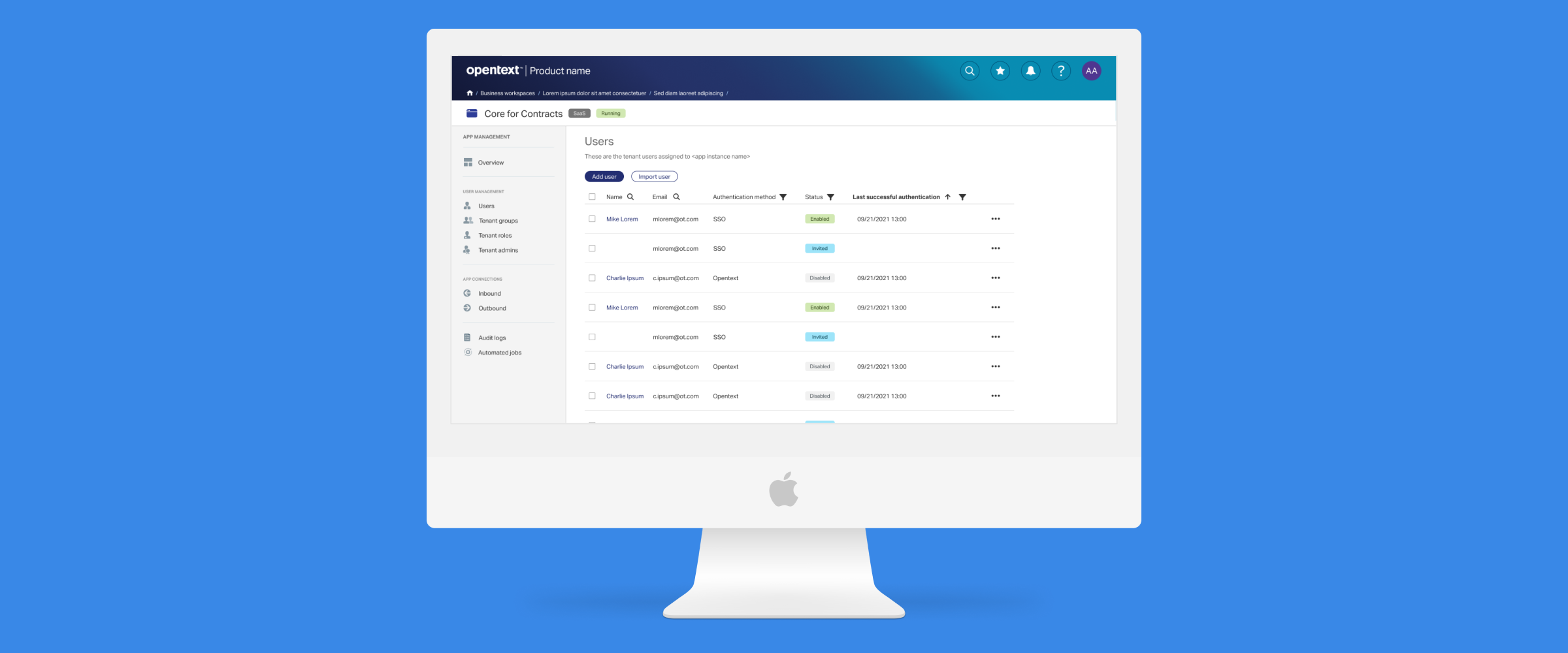
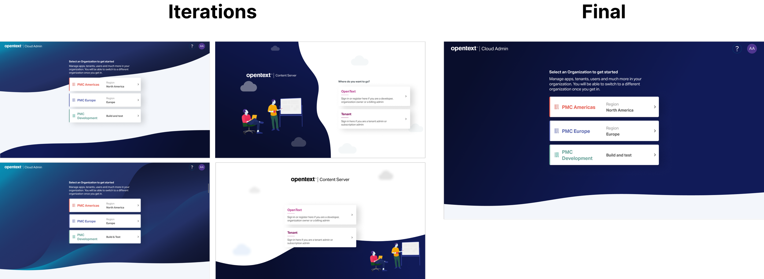
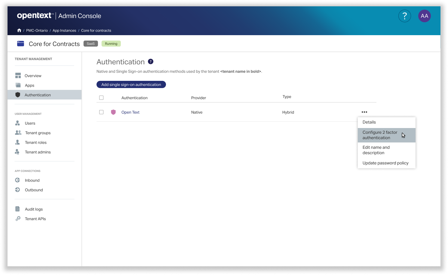
Once I had the final wireframes, I started the visual design. I designed the visuals for the entire tenant admin application. It’s a massive application. I am showing a few features here:
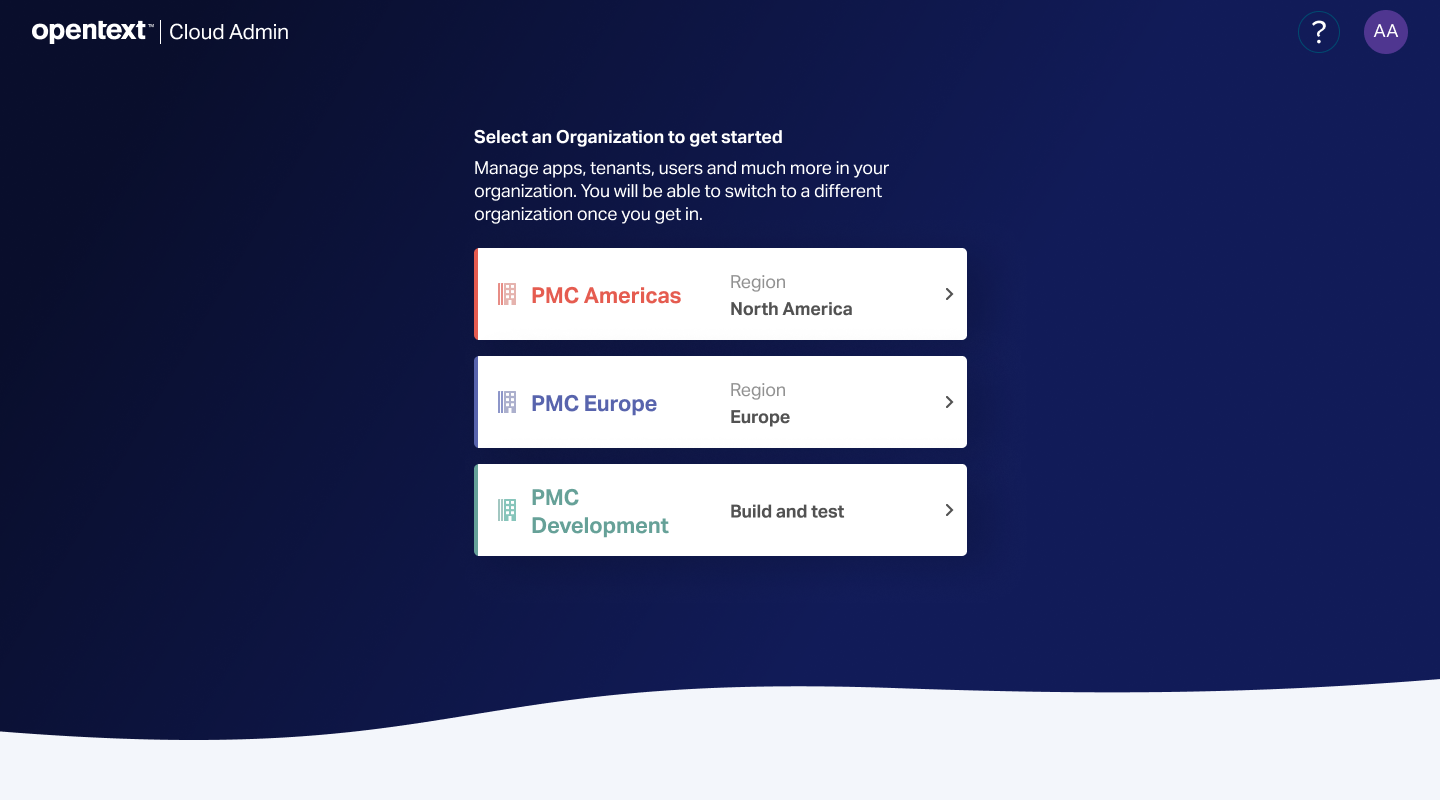
Login screen
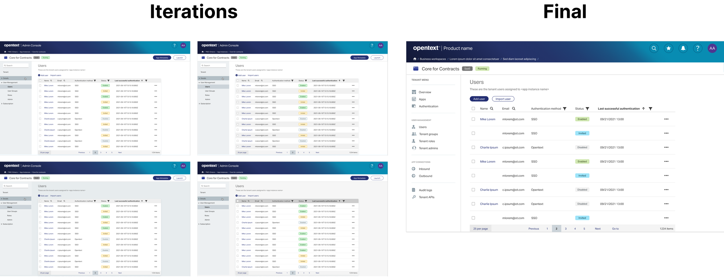
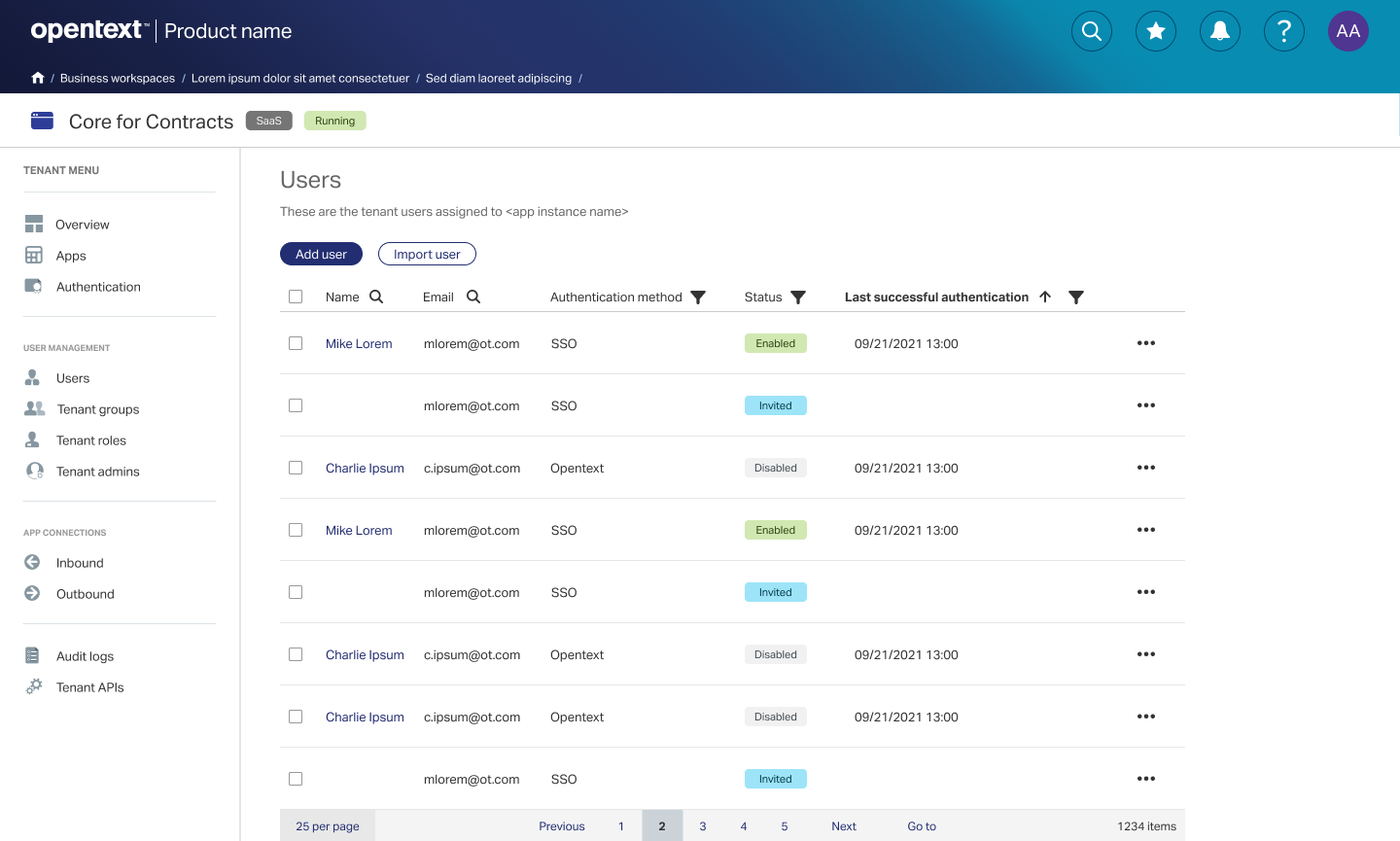
The data table
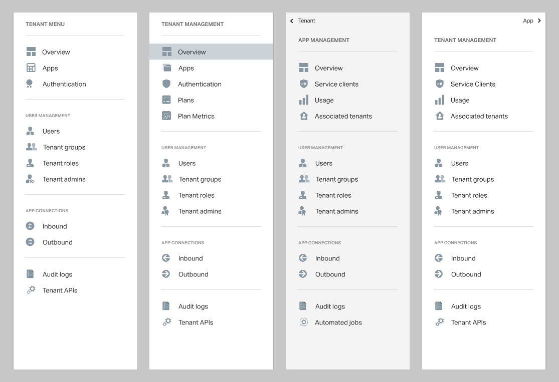
Global and left navigation
Login Screen
Table
Global Navigation
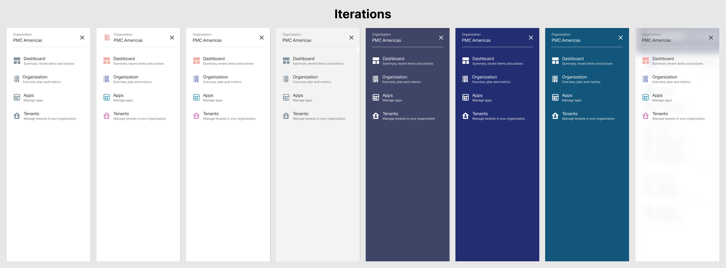
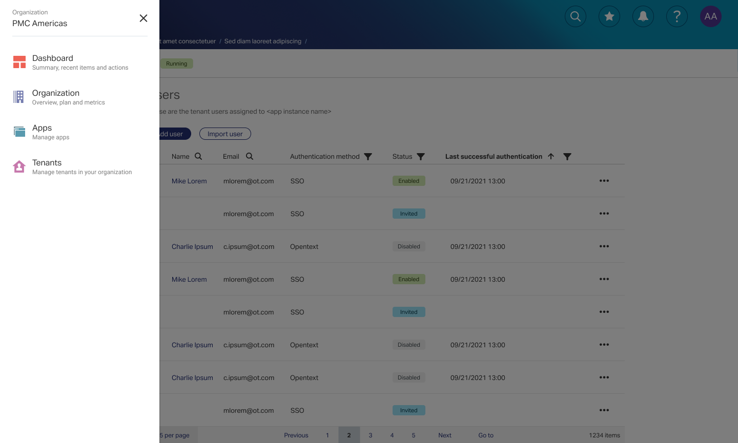
Left navigation
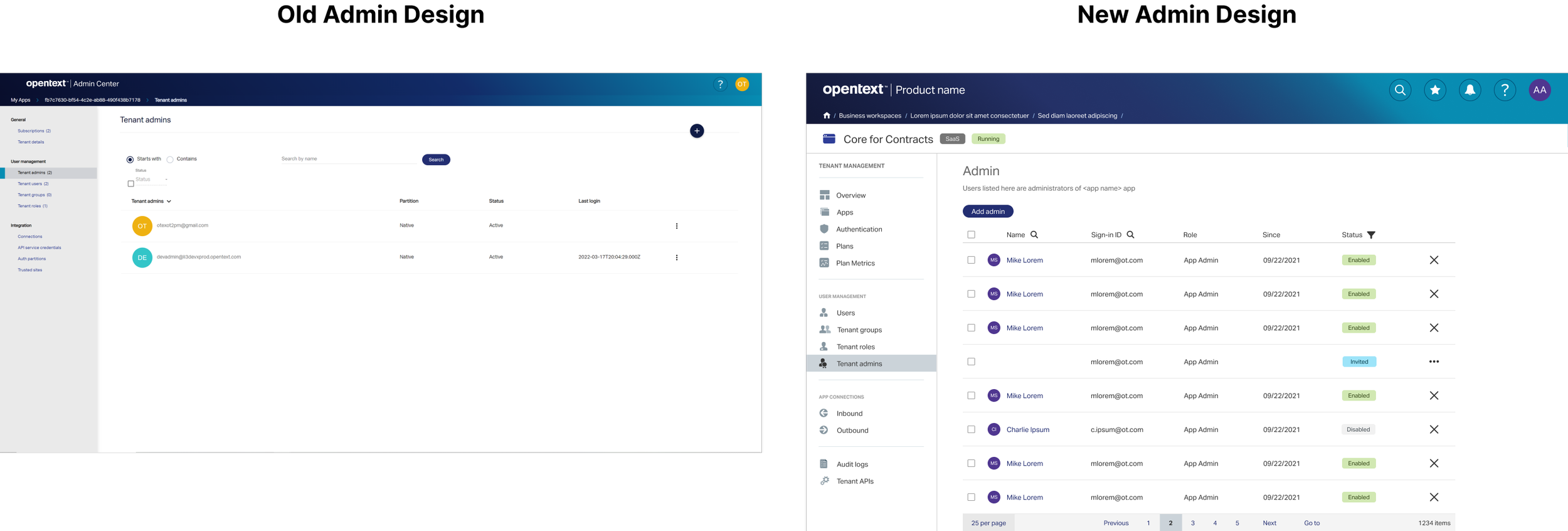
This is evolution of the design from old to new. This particular screen is for tenant admin:
Thank you!