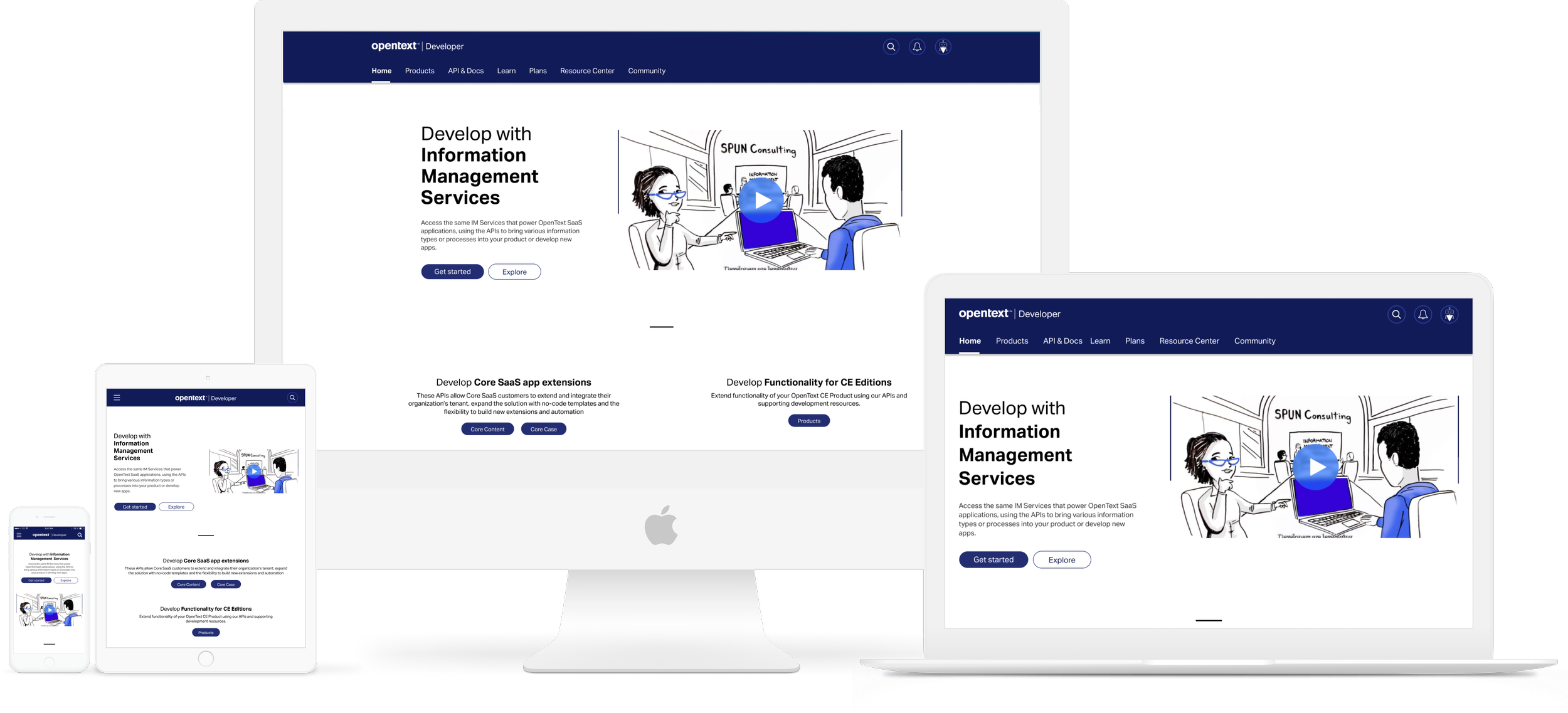
OpenText Developer landing webpage
Context
The Developer console is a space where client developers or third party developers can come in, download APIs, build their own applications amongst other things.
My role
Visual Designer. Part of user research and UX process
Core users
The core users are developers from OpenText customer base and third party developers.
Workflow
The user, mostly developers, would land up in the developer.companyname.com webpage. Here, there are a bunch of marketing content telling the potential user/client what the company provides for them.
Once the user gets into the key features, the company goes into detail about the various features that are provided.
The experience of the marketing and the develop inner pages should be a little different. Also, there is a difference between the experience in marketing page and when the user has signed in
Competition
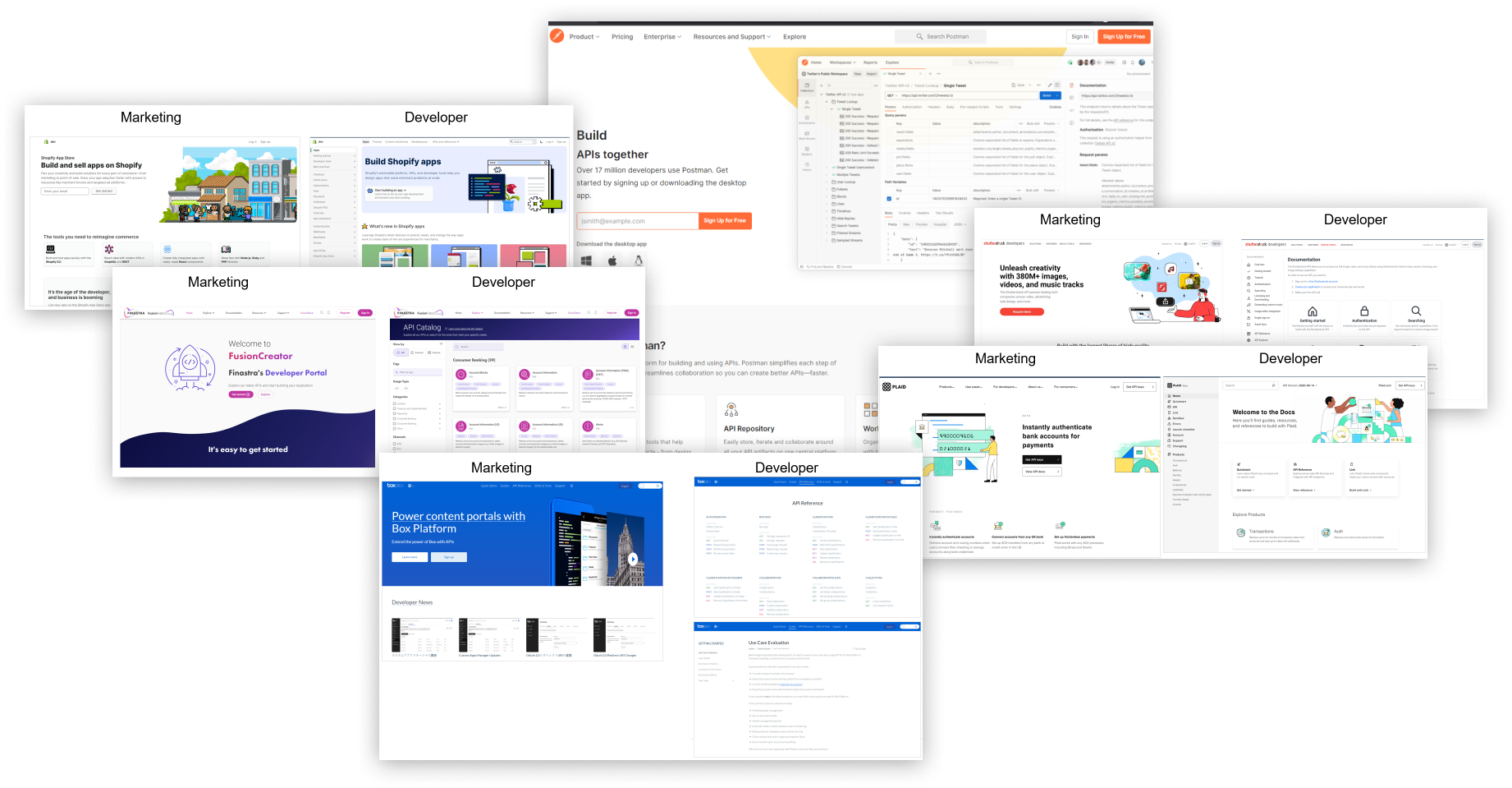
We looked at a few companies that were either direct competitors or provided similar service in other fields. The main thing we looked for was how the marketing page experience was and how that differed from the developer experience.
Our original site and its problems
This was our original site:
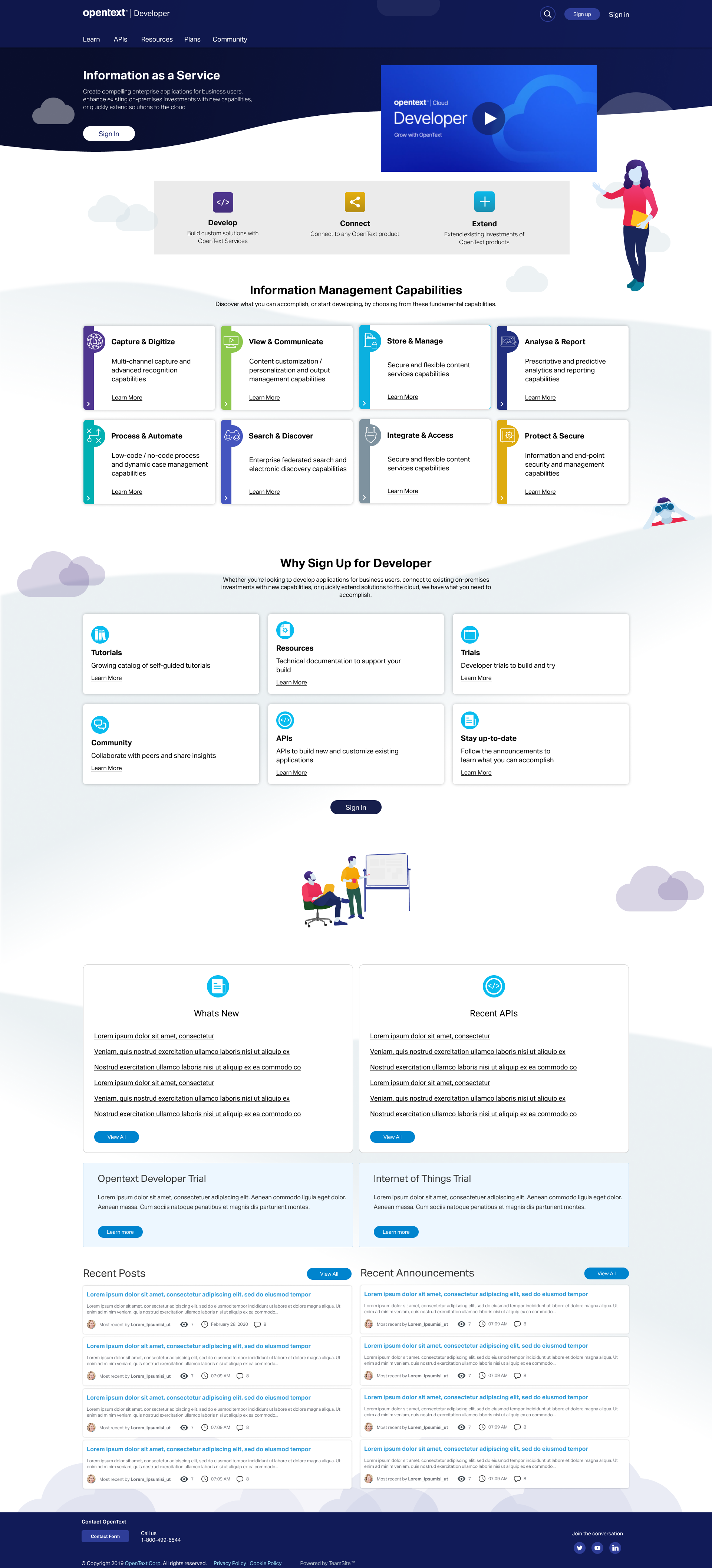
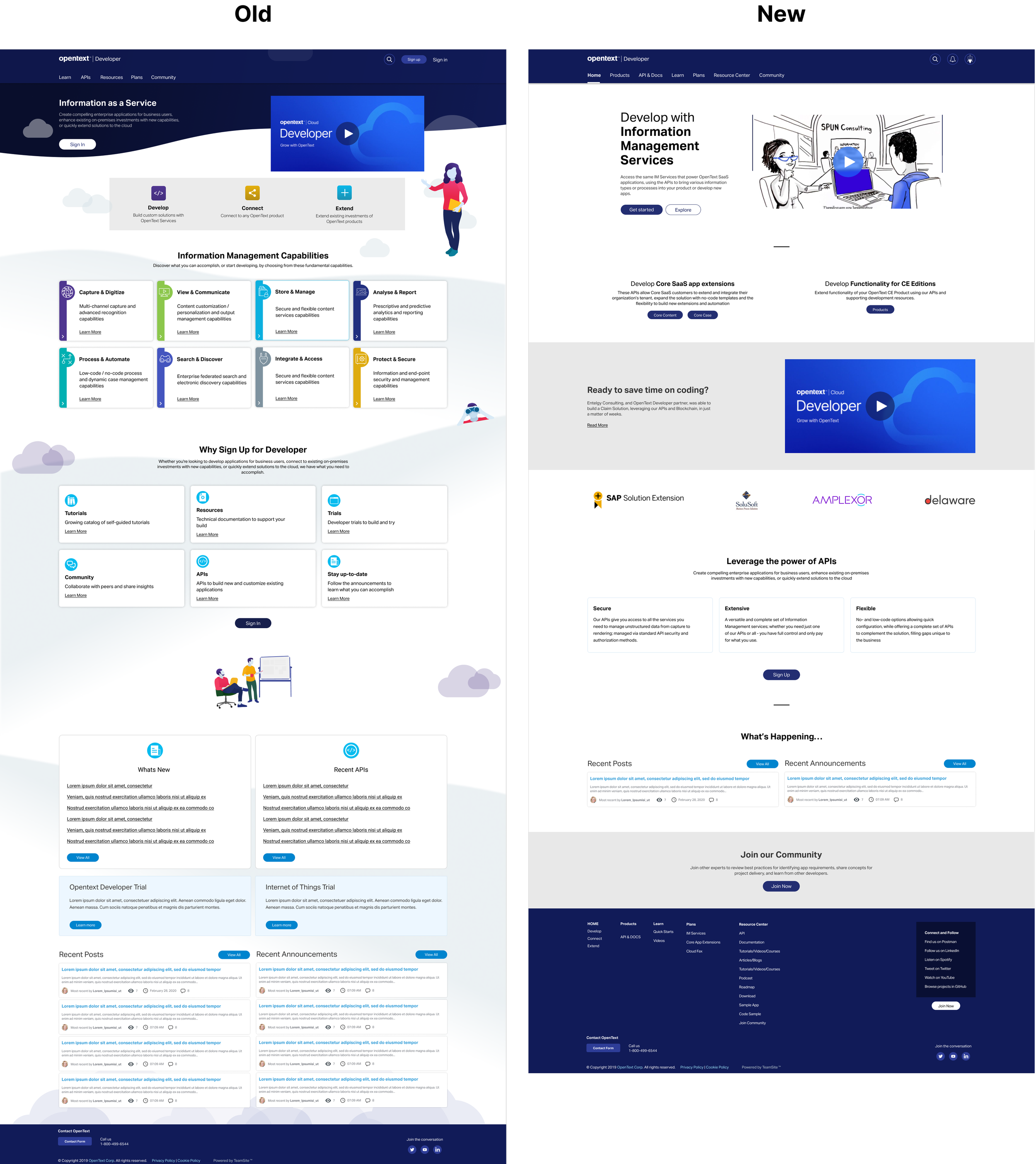
It was a good solution in its time. However, it had a few issues we needed to iron out.
The grids were not standardized for all resolutions. This caused many problems during implementation
A lot of the features were ad-hoc designs. This meant we didn’t plan out the components properly
The color palette was not fully thought out
The illustration can be improved
We went with the curves as a way of making the users feel very welcome. This style was getting a bit dated. We needed something a bit more modern
Button styles and icon could be more modernized
Since multiple designers worked on this at various points, there were many styles that were followed. We needed a component library so there is a ready reference for future designers
DevX is a large project with multiple verticals. Each of them had their own design language. We needed to put together all the designs in one place so we would know what has happened so far. Again, a component library would be of great use here.
Various fixes to the problems
New grid from dev
The confluence page to show how components were organized
My visual design component library
Working from ground up
Proper UX practice with user testing
We learnt from our mistakes. Design, after all, is an iterative process.
New Grid from Development
First thing we did was work closely with developers to resolve the gaps between design and development.
We standardized the grids for various break points:
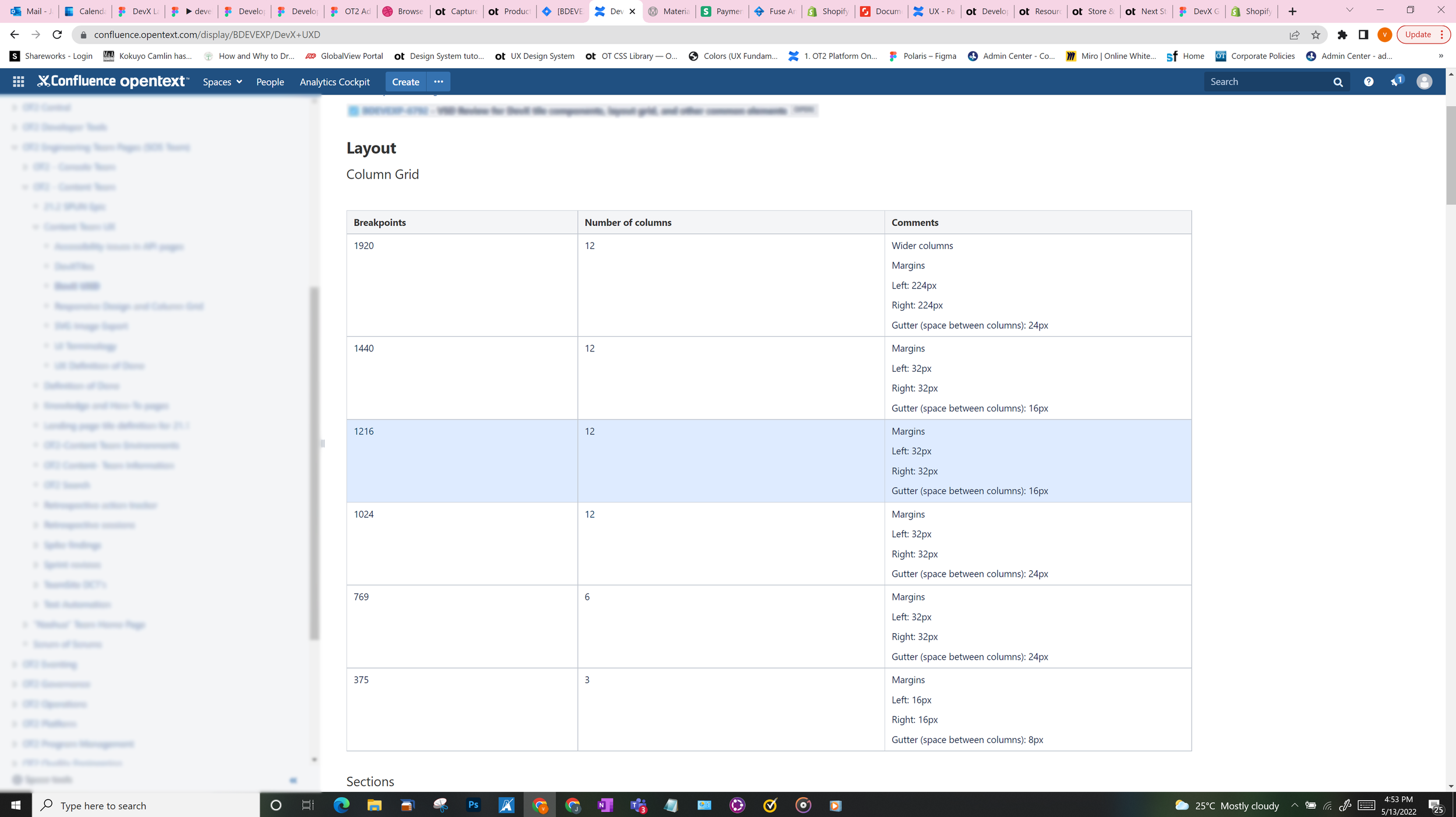
Once this was agreed upon, we then defined the various needs of tiles across the website. This was done as a team with developers, UX designers and PMs:
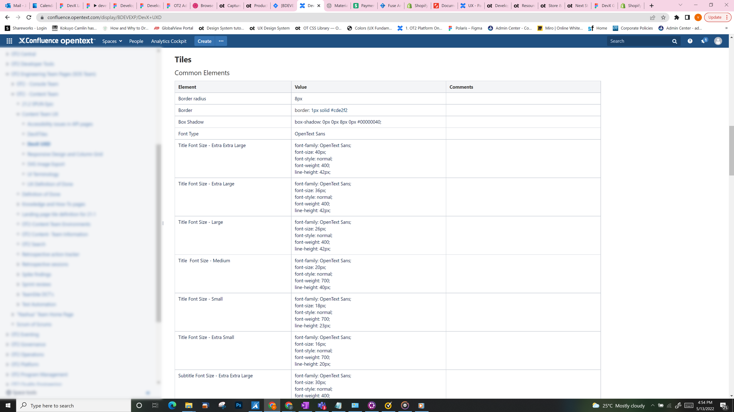
Next, we took our existing tile designs and gave them different properties and classifications. For example, some tiles will have icon and text, others will have only text, a third kind would have text and link etc.,
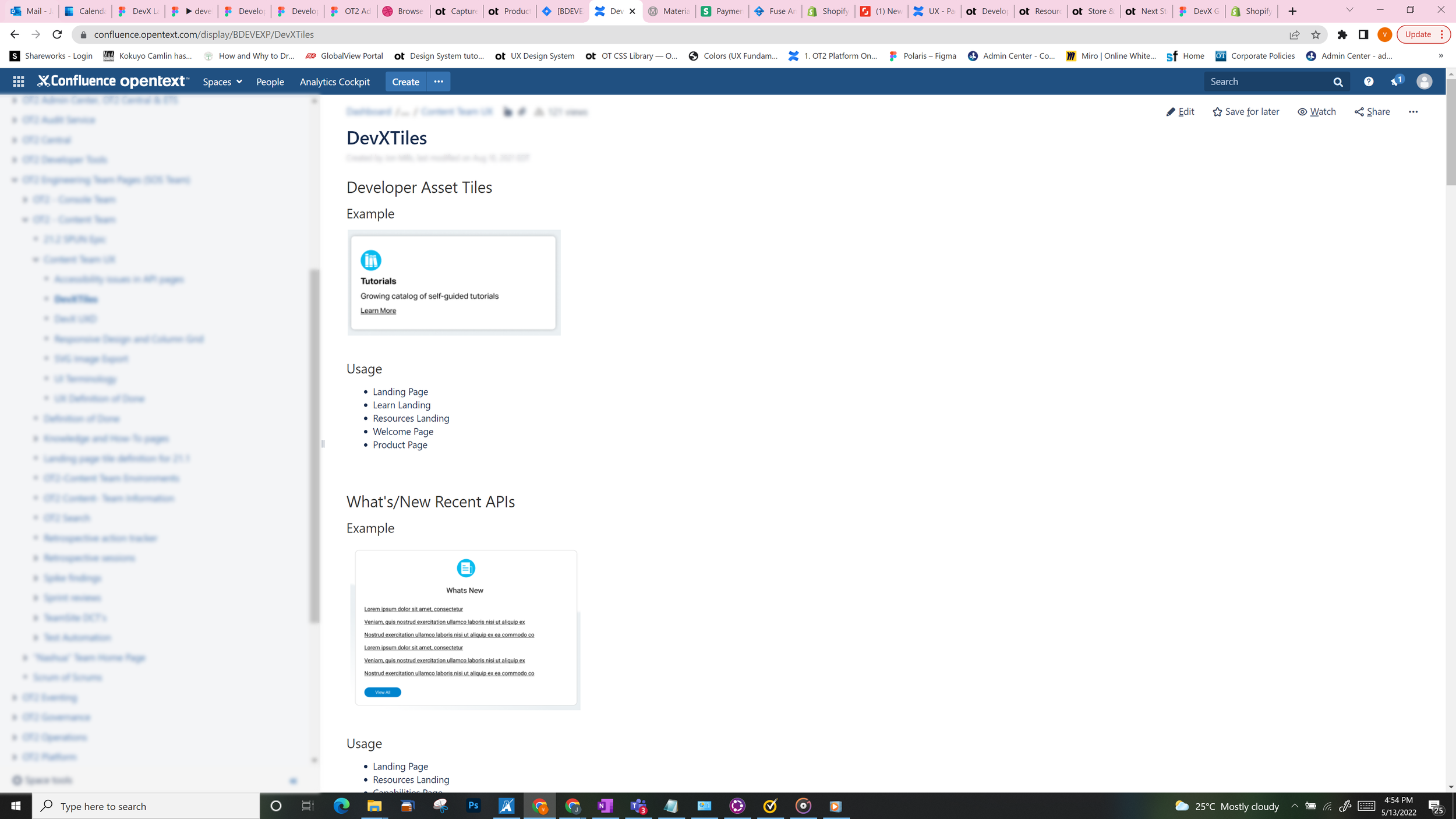
We defined all the rules each tile would follow and how they behave across all our break points. This gave us a solid ground on stand on.
Visual design component library
Once the grids and component definitions were standardized, my next task was to compile a component library. Since multiple designers worked on the earlier versions at different points in time, there were many styles and ideas that were pursued. We first had to consolidate all the designs:
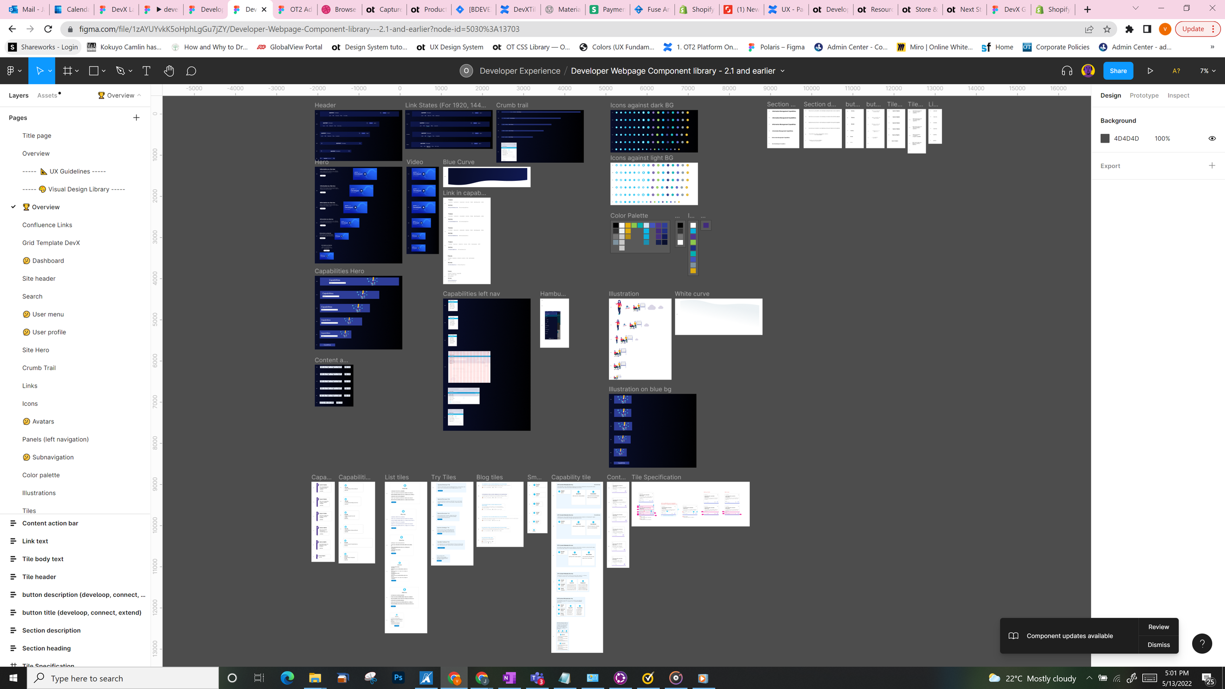
We went through all the files of all the designers who worked on every project within the DevX umbrella. We then picked up all the components from various designs, both old and new, and compiled it into one place. We finally had a working component design library.
Here is tiles that we designed for our webpage as well as tiles from other parts of the DevX umbrella:
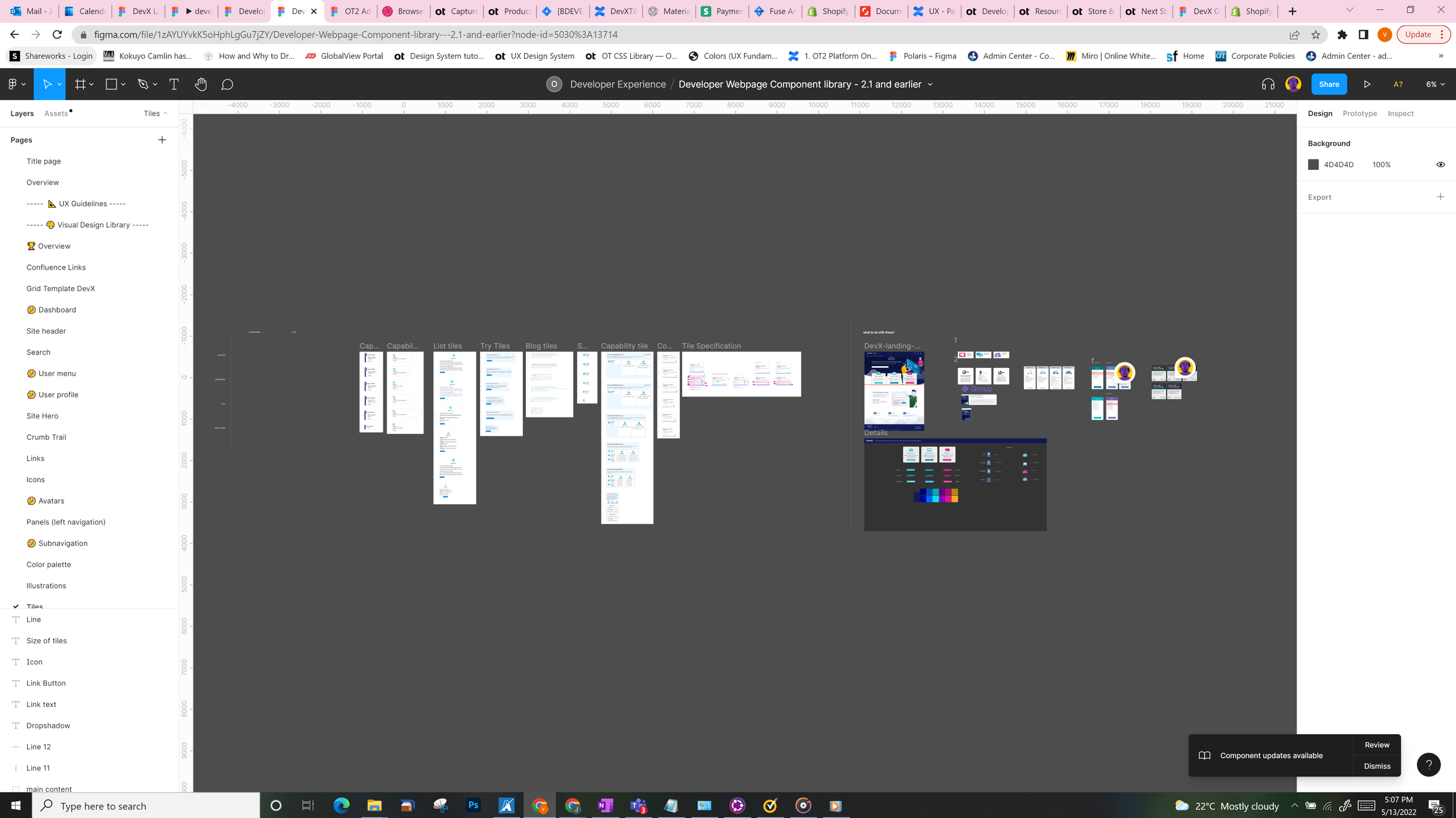
And a detailed view of one of the tiles:
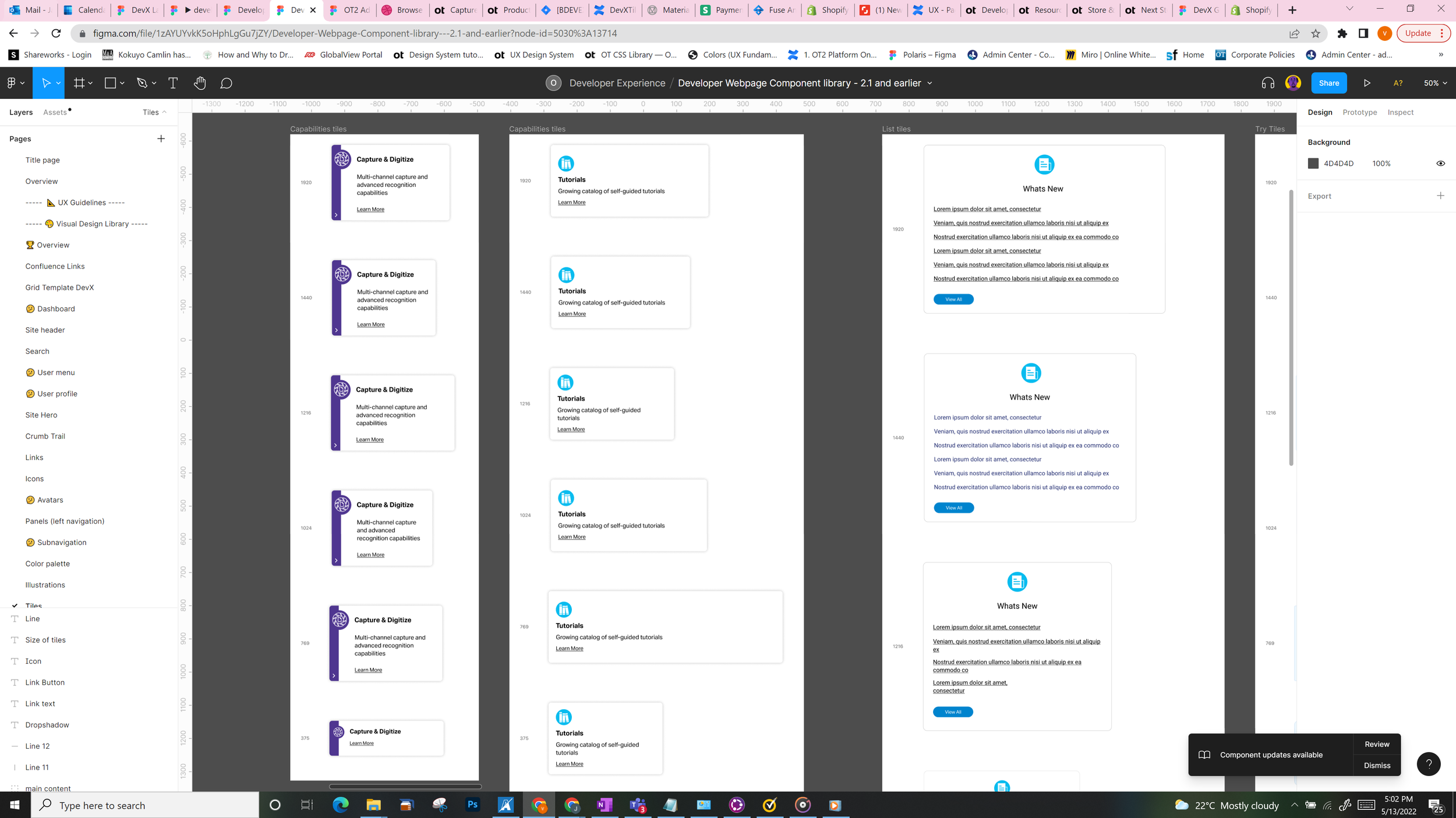
Every tile that’s been created across the DevX project is compiled here. Each tile is also organized as per the break points. So it's easy to use these for any responsive designs in the future.
New landing page requirements
The three main features that most attract our customers are: Develop, Connect and Extend.
With Develop, the user can develop their own application using our API resources, tutorials and others.
With Connect, you can connect to any OpenText product and service
With Extend, you can extend/enhance your existing OpenText purchase with additional features, APIs etc.,
Of these, the most important feature that we wanted to push was Develop. Users responded overwhelmingly to this.
So when the user lands on our webpage, they need been shown this first. In our earlier design, the emphasis is on Sign in rather than Develop. On a laptop screen, this part gets cut. So a majority of the screen real estate was taken up by marketing content and not a feature that was selling really well.
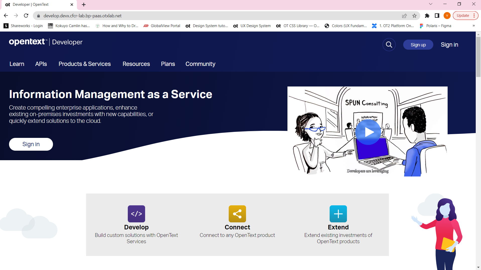
So our new design had show that there are three entry points to developer console and of them, Develop was most significant.
UX
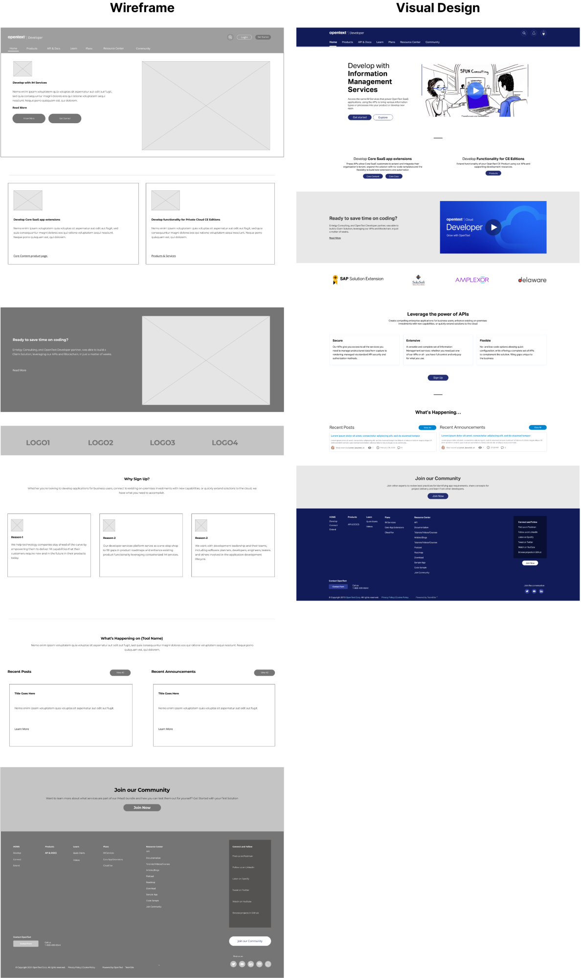
Our excellent UX designer went through the process perfectly and arrived at a set of wireframes. These were the end result of intense design reviews, user testing and multiple rounds of iterations.
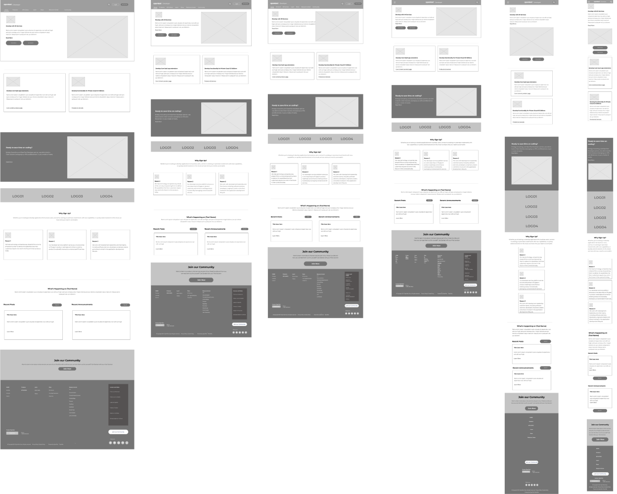
The key solution was to remove the marketing "swish " and go directly to Develop, Connect and Extend. The Develop section takes up more real estate to emphasize its importance.
Visual Solution - Evolution
I used the wireframe's structure as a jumping off point. Here is the evolution of the visual design:
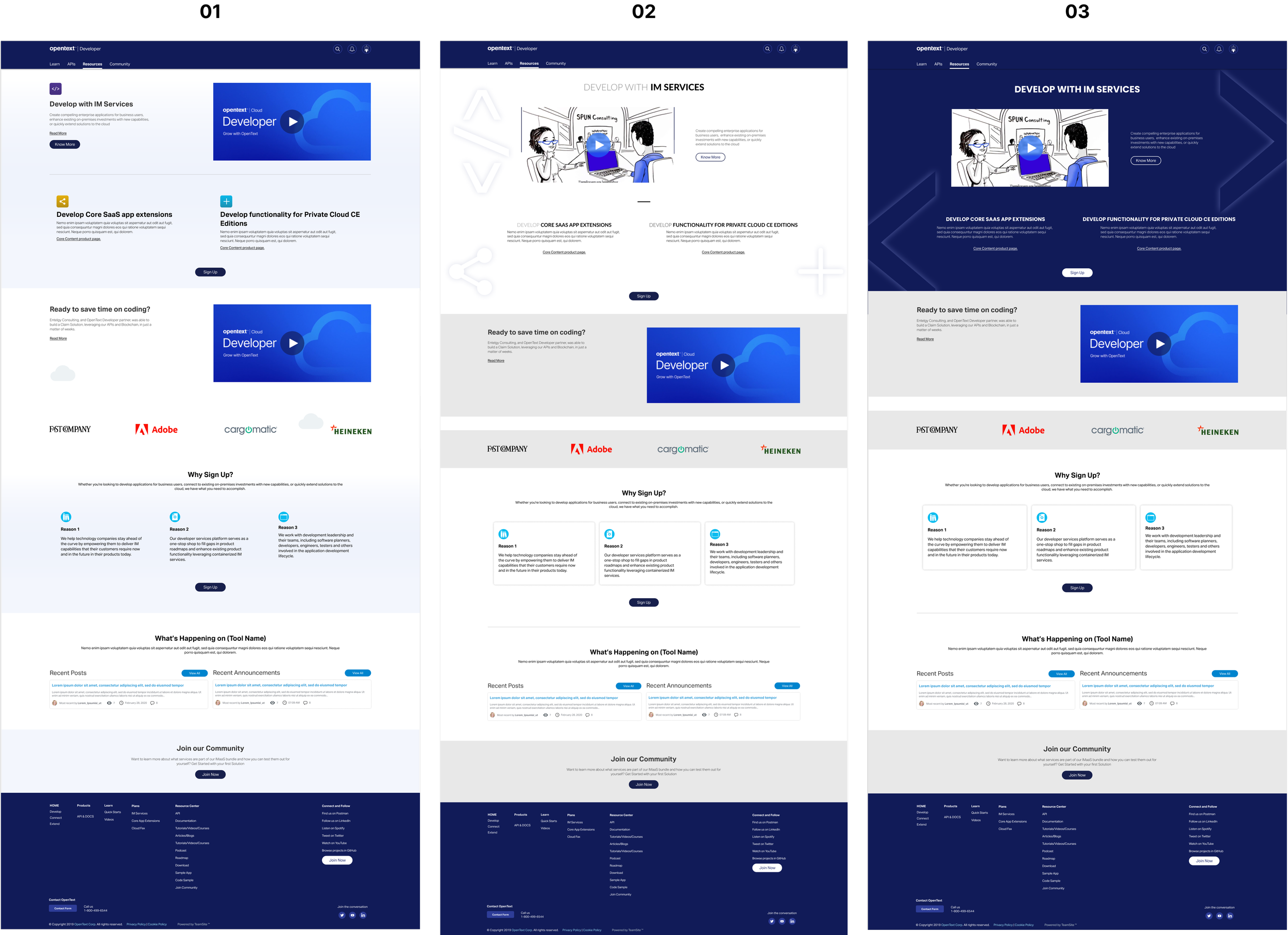
01 - This is one of the earliest versions. Here we still retain many of the old design style - the swishes in the background, the clouds, the old icons for Develop, Connect, Extend etc.,
02 - This evolved to a light theme &
03 - a dark theme. The icons are moved to the background to be less conspicuous.
Eventually, after multiple iterations, we landed up with final design.
Final design
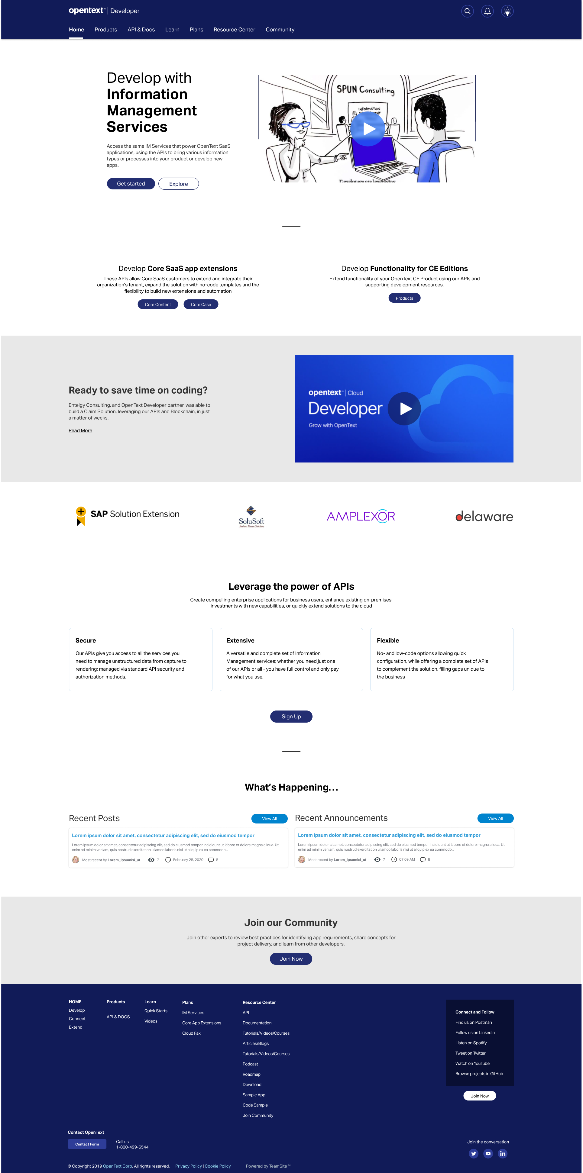
All the icons, illustrations, swishes and other artefacts are removed. We kept lots and lots of white space. We also removed most of the tiles. The new designs breathes way better.
Here is a comparison of the new design against the old:
And another to show evolution from wireframe to final design:
And responsive design in all its glory: